
Inflation analysis – From Zero to Hero
A thorough, hopefully comprehensive, guide on applied macroeconomics

Welcome. In this post I am going to debut a new series on this blog, “From Zero to Hero”. The basic idea is to share almost everything I have learned about macroeconomic analysis over the years, hoping it will inspire and/or inform the curious and the passionate about applied macro.
In a best case scenario, these materials can help people coming into the economics job market less green and empowered to hit the ground running. Worst case scenario AI steals all credit and some OpenAI-like firm takes over the whole economics field. These are very exciting times to be alive.
Truth is that I also see a lot of value in this kind of content as recycling exercises, even for the more seasoned economists that do/have done this job for years but still want to learn something new and improve. If you have been an economist for a long time, maybe you will find a few useful tricks here, or, better even, inspiration to share tricks of your own with others too.
These posts are likely going to be significantly longer than usual, so feel free to scroll to the parts that interest you most or, preferably, sit tight and enjoy the ride. As with most of my content, there will be an Excel spreadsheet tied to all data, calculations and charts within the post.
Enough of an introduction, let’s get to work.
Motivation - Who cares about tracking inflation, and why?
Different kinds of stakeholders care about inflation, but sometimes for very different reasons, so it is worth classifying and exploring these in more detail. Here’s a nonexhaustive, although relatively detailed, list
Consumers – Consumer inflation informs how costs of living evolve over time. Not always, but often when consumers talk about inflation, they refer to very specific and salient prices like foodstuffs, gasoline and other fuels, housing (rent and utilities). Most of these items (housing aside) are volatile, meaning that regular consumers’ care about inflation is rather cyclical. When things are fine, they are the least likely group to care about what inflation data says.
Academia - Counterintuitively to some, this is the area whose stakeholders may care the least or most, even within the economics field. Researchers or professors will either be at the scientific frontier of the topic or quoting books written in 1950 pretending they know everything about inflation.
Corporate firms - While most organisations are bound to care about inflation one way or the other, its fair to say that the degree of sophistication with which they do varies a lot.
Tech savvy companies, for example, are very much into the idea of dynamic pricing and advanced supply chain management. These will be diving deep into the micro-level data of producer and consumer index baskets (more on this later). They can employ PhD level data analysis and identify patterns in prices that no one else will know but them.
On the opposite side of the spectrum, some bigger, strongly regulated and more bureaucratic firms will mostly care about inflation to the extent that it informs their annual budget decisions. Revenue projections, wage negotiations, every now and again a deeper discussion about key specific prices like crude oil or some other commodity.
Politicians and political commentators - Similarly to corporates, politicians’ bandwith for inflation can vary wildly, and their attention span are often a function of how big of a problem inflation has become at given point in time in a given economy. There’s great opportunity for impactful analysis work in those instances, as they support and guide institutions, be it in the form of law or public education.
Policymakers - These are often incorrectly perceived as part of the aforementioned. Policymakers are in fact (or at least expected to be) a part of technical body of the state, serving the public and not necessarily the government in power. These are the central banks and the finance ministries, which will care about inflation very closely.
Central banks’ key objective is to target a given consumer inflation rates while at the same time managing people’s expectations on its ability to achieve such target. This entails producing sophisticated models to analyse and project inflation, much in the spirit of the ones we will explore further into this post.
Finance ministries will care about inflation more secondarily, but will very much care nonetheless. Inflation informs annual budget decisions, revenue growth expectations and which areas public spending should be focused.
Investment sector - This is often where stakes can be the highest, as decisions made purely based on inflation analysis can either have a small impact the wealth and future income of millions of pensioners or a huge effect on the wealth of some millionaires. Unsurprisingly this is the kind of work that most romanticises what economists do, often inaccuratelly. Inflation analysis here is often done very professionally, well presented and focussed on bottomline takeaways. It is worth pointing out that depending on which kind of investor you are, certain aspects of the analysis will be more important than others.
Often the analysis here includes forecasting, and macro hedge funds will be most concerned with short run accuracy at the highest speed, in order to trade accordingly. Meanwhile, pension funds are more likely to be concerned with medium to long run projections, which may include a good amount of storytelling involved. These two focuses require different forecasting strategies and models.
Knowing who you are analysing inflation for is key. It should frame how deep one needs to go and where the focus of it should be. As we might as well be producing analyses for multiple stakeholders at the same time, in which case you could do it all, but taylor how you present to each spectator accordingly. There will be more on this point later.
Our next step is to discuss definitions and data.
Definitions - What is inflation and where can I find it?
According to Gemini, inflation is a measure of the general and sustained increase in prices for goods and services over time. This is accurate, but vague.
How is it measured? What is the meaning of general? How long is enough for the increase in prices to be considered sustained? Let’s quickly address these with a simple formula.
Here, “π” stands for inflation at time “t”, which can be defined by a discrete frequency (weekly, monthly, quarterly, annualy), “P” stands for a price of good “i” and “w” is a weight for that good. Weights are constrained to be strictly positive and add up to 100%. Depending on the type of index inflation is measured, “w” can be indexed to a fixed period “t” (Laspeyres index) or change in time contemporaneously with the data (Paasche index). Some statistics offices will combine the two measures with a geometric average (Fisher index).
So in short inflation is a weighted average of the percentage change of a representative basket of “I” goods and services. If the purpose of the basket is to represent consumers, then final goods and services will be selected and weighted in accordance with an estimate of how much each of these goods represent in total consumer expenditure (hence the consumer price index, or CPI for short). These consumer weights can be adjusted to a specific cohort, either by income, age, gender or ethnicity, but are most usually presented as a national average.
If the purpose is to gauge costs to firms, then a basket of primary and intermediate goods and services are weighted by the same logic, hence representing producer prices (thus, the PPI index).
National accounts statistics (the surveys that measure GDP), also have their own price level measures, called GDP deflators. These refer to a wider basket of goods and services either produced or consumed in a given economy which don’t necessarily represent firms or consumers.
To gauge the prices and weights, statistics offices will conduct extensive surveys checking a selection of quantity-adjusted prices for goods and services and eventually running censuses every five to ten years to update weights, add or subtract items, to better capture consumer behavioural shifts over time. Most countries follow international standards, making inflation data easily comparable across economies, but its always good practice to bear in mind that cross country comparisons will likely be comparing not just different regions, but also different baskets that represent different cohorts of society.
It’s uncommon for these updates to create historical revisions to price data, but revisions are not impossible, due to relevant methodological changes. In such cases, both statistics offices and public data provider services alike will make an effort to consolidate time series from different methodologies to build large historical datasets at the cost of eventual measurement error.
This whole explanation about how inflation data works also hint to where it can be found: national statistics offices. Almost every country has one, and their websites should provide monthly, if not at least quarterly, national price level data releases. Let’s have a few examples linked below:
Unites States’ Urban Consumer Price Index - Bureau of Labour Statistics
United Kingdom’s Producer Price Index - Office for National Statistics
Europe’s Harmonised Consumer Price Index - Eurostat
Brazil’s Índice Nacional de Preços ao Consumidor Amplo - Instituto Brasileiro de Geografia e Estatística
Mexico’s Índice Nacional de Precios al Consumidor - Instituto Nacional de Estadística y Geografía
There are also means to obtain data for multiple countries at once. For example, in multilateral institutions datasets like the Monetary Fund and the World Bank. These are convenient ways of obtaining cross country data for free, although not necessarily timeliest or most accurate. Alternatively, some organisations will sell it as a service, competing in bandwidth, tractability and timeliness of the data releases for a price.
A final point worth mentioning about inflation data is that countries can, and often will, have more than one source of consumer or producer price index, sometimes even within the same source providers. In those instances, it is important to note which index is conventionally reported to the wider public as well which one is tracked as the central bank target.
We are now through the boring part. We can finally jump into some actual data next. For this post’s example exercise, I have chosen to download Brazilian CPI data, which is a dataset I am fairly comfortable with as it also just so happens to be my native country. You can check all the numbers presented next in this spreadsheet link.
Data analysis, step 1: Disaggregation and growth rates
As we first download and start exploring CPI data, make sure to collect a large sample of years at the highest available frequency possible (usually monthly), as well as a comprehensive set of underlying components that are in line with the way local experts analyse the inflation headline.
As we start dealing with bottom-up inflation data, we are posed with an important question: how exactly should we break inflation apart by its components?
At this point, we have two options. In the first one, we can take the internationally standardised “Classification of Individual Consumption According to Purpose (COICOP)” division, the way which we are usually conveniently presented by national statistics offices. As a second option, though, we can look for or add up ourselves custom-made subgroups from each individual items of the price basket. The first option is great for cross country coverage and international comparisons, while the second option is usually best for country-level coverage and forecasting. Let’s focus on the second for a moment.
To know how locals analyse their country’s inflation, look shortly into publicly available inflation research. Local central banks’ quarterly monetary/inflation reports are probably the best place to start. Secondarily, resorting to finance ministries’ projection reports and/or IMF’s annual article IV staff reports can also be very helpful and nonexhaustive support to your analysis.
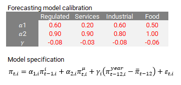
As we investigate a very recent Central Bank of Brazil (BCB) Monetary Policy Report (September 2025) we can find the following description of recent data events and a table of its updated inflation outlook:
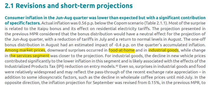
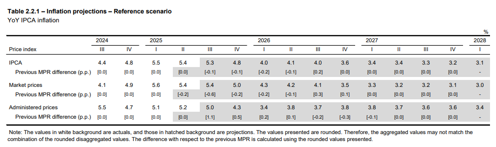
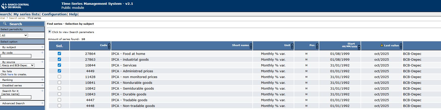
From these two excerpts, we identify the language with which this specific central bank communicates its inflation analyses and how interprets it. The central bank projects a “Market Price” and a “Administered Prices” subgroup, from which they add up their headline. Furthermore, the “Market Price” subgroup is also broken down into three aditional segments, “Food-at-home”, “Industrial Goods” and “Services”. As we explore the BCB’s database, we find that it conveniently provides these time series in monthly frequency, as below:
Data are presented in monthly growth rates. The next step is to find out the exact weights in each component. And this one of the reasons why you’d rather learn it here rather than from an textbook somewhere. While most manuals would suggest you to fetch micro price data to add up each individual component like the BCB would, my personal suggestion is for you to approximate the weights using ordinary least squares and then normalise coefficients to add up to 100%.
The procedure is simple:
Assume that our price basket is a combination of component inflation rates and weights, as below.
By assuming weights are OLS coefficients, we can pose the following minimisation problem.
And then equalise betas to weights after normalising them to add to one.
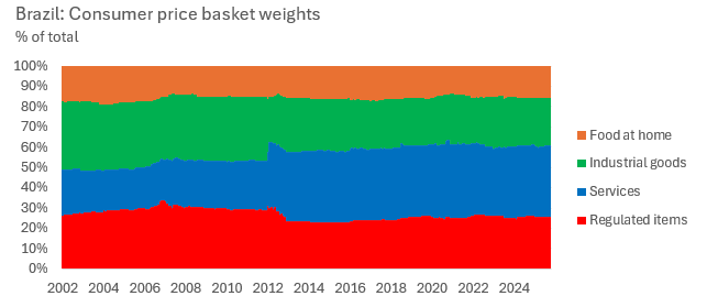
We can do this procedure on a rolling regression basis, and thus uncover how the weights change over time. This will work for most disaggregated CPI whose weights and components have reasonable variability and importance in the headline. Plotting the weight data yields.
Now with a bottom-up dataset in hands, we can add up component contributions to monthly inflation, as below. This setup is useful as it allows the analyst to precisely read which components are driving inflation at the margin.
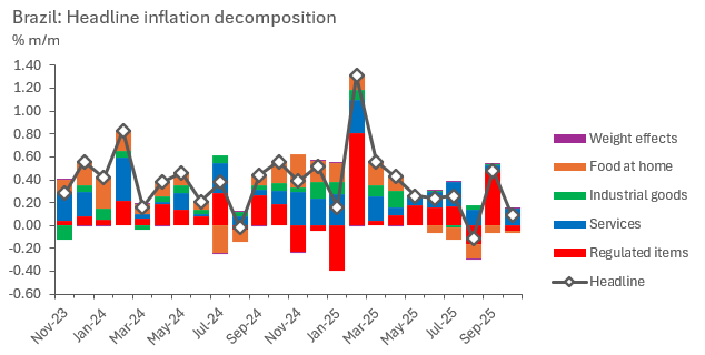
Next, we can bring this analysis to annual growth rates. We can do so by discrete compounding the monthly headline changes and component contributions.
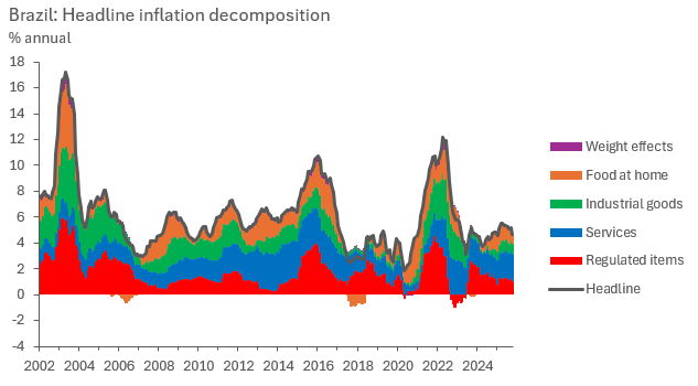
As we analyse our bottom-up inflation results, it becomes clear that while headline inflation rates tend to run around a historical average most of the time (which, in the case of this sample, tends to be around 5.5% y/y), the composition within which it runs around that average changes drastically, and can certainly point to what’s next. This is what motivates the bottom-up analysis.
The attentive eye will notice a residual component called “weight effects”, these are residuals, as our method doesn’t perfectly capture headline changes with our components if weights change within the estimation sample. Yey, the purple contributions are barely noticeable and arguably negligible. Good disaggregations should aim for that. The investigative reading bit of this step certainly helped in finding which components work best to aggregate up to headline inflation, don’t skip it.
We are ready for our next step, which is where we deal with seasonality.
Data analysis, step 2: Seasonal patterns
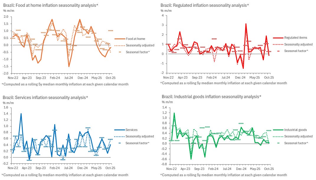
Seasonality is a big aspect of time series analysis in general, but when it comes to inflation, it is often key. There are few exceptions to this, only in few cases statistics offices report their official numbers post-seasonal adjustment, straight from the source. An emblematic case being the United States.
Seasonality is also another reason why we want to work with a bottom-up approach to headline inflation to begin with, as every component and subdivision in the price basket will present a different seasonal pattern.
Dealing with seasonality requires a choice. We can either adjust for seasonality or make it a feature of our analysis, but first we need to identify these patterns by estimating them from original data. To do this, we make use of the additive model time series model, as below.
Where “Y” stands for our observed data, “T” a time-dependent trend, “S” the seasonal component and “I” being the irregular (residual) factor. We can translate that language into our inflation data as such.
Where superscripts “t”, “s” and “i” mimic their corresponding meaning from the aforementioned model above. Our next step requires us to estimate trend and seasonal inflation. While there are algorithms that take care of that, I’d very much prefer the reader to understand what these algorithms are actually doing so that they avoid becoming “button pusher/command caller analysts”.
Trend inflation is a simple seasonality-void trend, meaning that it can be estimated from a sample that averages across a period where the seasonal pattern have arguably cancelled each other. Seasonality in inflation repeats itself through the course of a year, which means we can work with averages that roll through multiples of 12 months. We are going to work with five years in this example, which means our trend estimate is
Which simply compounds inflation within five years and then brings it back down to a monthly rate.
Next, we identify seasonality through a measure of centrality, which could either be a mean, a median or a mode. I find the median to be the most appropriate measure here, as inflation shocks would pollute the mean too much in small samples such as five years. Which is also why a longer dataset is so useful here. We take a month-conditioned 5-year rolling median, which in short means taking the median monthly inflation rate of every January, February, March, and so on, until December, for the last five years. That is our measure of seasonality.
After identifying and estimating both trend and seasonal inflation, we can choose to analyse the data in light of its seasonal patterns or seasonally adjust the data, which would entail the following simple computation.
We can then present charts in whichever way we find most useful, be it seasonally adjusted or not. When analysing non seasonally adjusted data, though, it’s worth comparing monthly numbers against its seasonal factors, as some fluctuations could have been entirely explained by seasonality.
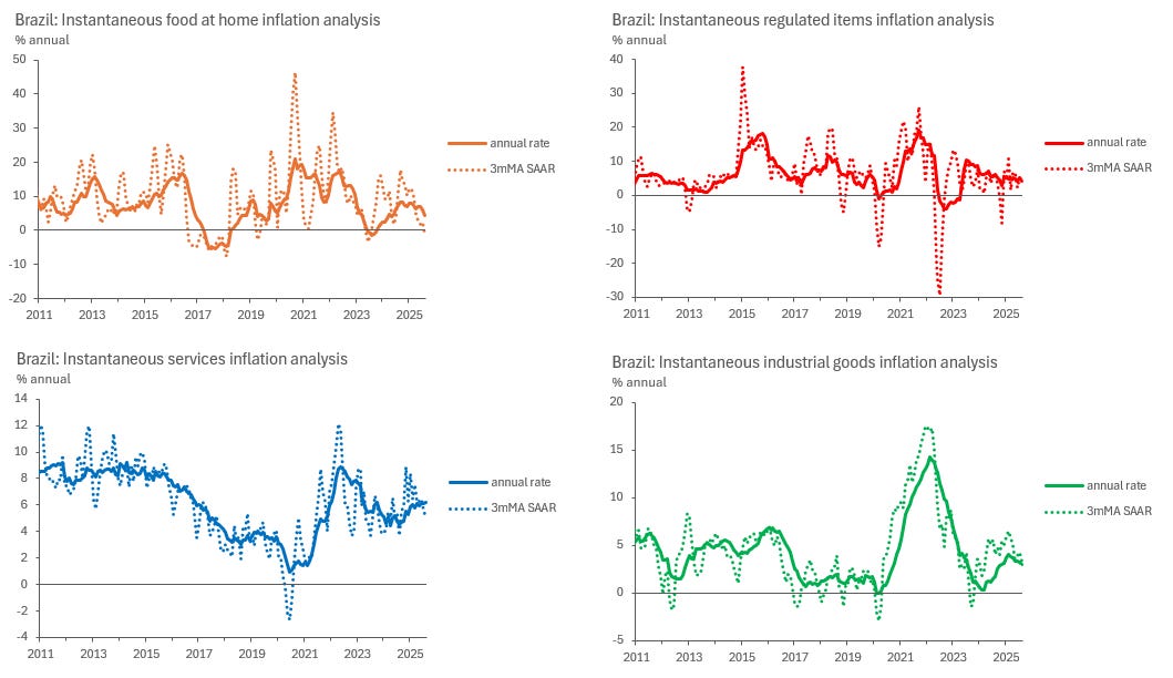
With seasonally adjusted data, we can also make use of concepts such as “instantaneous inflation rates”, which are essentially 3-month moving averages, seasonally adjusted and at an annual rate (3mMA SAAR). These are very useful to compare to year-on-year rates, as they inform what is happening with each item at the margin and point to where 12-month accrued inflation rates are likely to edge next. Its only drawback is its higher volatility, which can make the analysis noisy some of the time.
In the charts below, we can see how it can be hard to make sense of Food at Home inflation rates at times, but easy to see where annual inflation is likely to go next by eyeballing instantaneous inflation rates in Services and Industrial goods, for example.
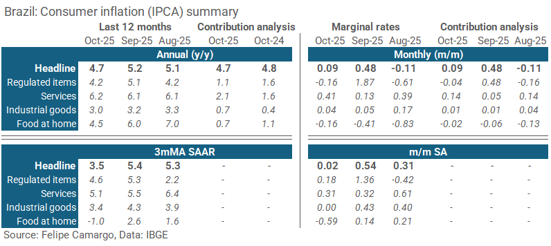
At this point, we can also explore the use of alternative visualisation tools, such as tables, to summarise recent trends. The choice of tables are often very useful to emphasise developments at the margin, as opposed to long line charts which can draw too much attention to a not so relevant past. See an example below.
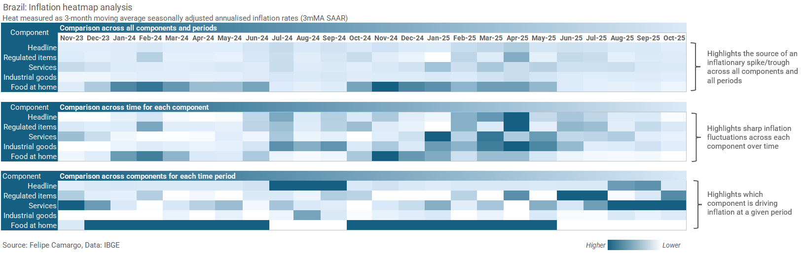
Alternatively, analysts could also resort to heatmaps to better highlight specific patterns in the data. Just make sure to use them clearly, as pointed in a previous post in this blog.
With these tools, we are all set up to analyse inflation data in much detail, enough to build stories around recent events and even speculate about the future. In fact, this our next step, forecasting.
Data analysis, step 3: Modelling & forecasting
As we move into the forecasting step a whole universe of options arise. There are nearly infinite ways to incorporate all the elements we have touched upon in the previous sections. To keep it objective, we should touch on a few general options before moving one with one example.
As far as inflation modelling options go, it is easier to understand them in two major categories, which are the statistical versus structural models.
In statistical models we are dealing with pure time series techniques, like most of the elements we have covered so far, which were about identifying and decomposing away patterns from the data, like seasonality and trend. Persistence, or memory, is also another important element we haven’t touched on yet, which we should introduce into this section as well.
Statistical model examples can be found in the classical autoregressive family (ARMA, VAR and its many variations), or more modern “machine learning” (should we call it AI at this point?) techniques, like random forests, neural networks, gradient descent-based variations, sequence models, and so on.
Most of these use approaches are, fundamentally, residual minimisation techniques, which basically means finding a way, either analitically (like in least squares) or numerically (like in gradient descent), to reduce observed predicted error.
Most of the time, these models aim towards accuracy, as they can be made rather complex and easily transform the final output into a Frankenstein, born misunderstood by its own creator.
On the opposite side of the spectrum we have structural models, which will borrow inspiration from some statistical techniques while constraining specific results based on some sort of theory. We have touched on the motivation behind this many times before in this blog (see here or here).
In short, in the context of economics, we most often reject models that imply absurdities - unless we can find a very well-argued academic reason - like, for example, that a credible monetary and fiscal tightening would lead to more inflation (do feel free to start a war on the comment section if you will).
Examples of structural models in Economics are structural VARs, general equilibrium, Phillips curves and other multivariate calibrated approaches.
To keep this post from being even longer, I am going to drop the more complex structural approach, as those have dedicated posts of their own. Instead, I will start from a statistical technique and move into a calibrated time series constrained with a cool story anchored by a certain degree of economic theory.
We start it all from a convenient regression specification we can apply to each inflation component analysed previously.
Where “π” denotes monthly inflation, “π(i)” and “π(m)” are irregular inflation the 5-year historical seasonal monthly median, both previously defined, “π(year)” is simply the rolling 12-month inflation rate, and “π(bar)” is the inflation target objective. “ε” represents our regression residual.
Parameters “α1”, “α2” and “γ” have important interpretations. “α1” symbolises inflation shock persistence, denoting how long it takes for an unindentified fluctuation in prices to phase away completely, the bigger the number, the longer the shock lasts. “α2” captures the degree to which seasonal patterns determine future inflation, if these patterns change too abruptly and/or often, then this coefficient tends to be smaller. Lastly, “γ” captures how effectively the central bank has been in supporting inflation target convergence, ideally, this coefficient is expected to be negative, as central bank actions would try to pin inflation down when it is above target, or up when it is below.
The convenience of our model is that it captures every single important concept we have covered up to now at a minimalist level, plus some theoretical structure which we are soon to introduce. By being minimalist, this is certainly not going to be the most accurate model for inflation, but surely a good framework for anyone to build on top of.
Let’s bring over that theory-based story now. We are looking for something to help our inflation target convergence argument identification. To do so, we need to properly adjust Brazil’s formal inflation target to something that was rather acted upon, which was, as I’m going to argue, closer to its target tolerance ceiling rather than its centre.
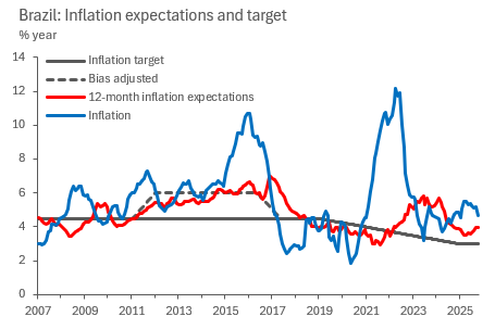
During the years 2011 to 2016, the central bank board, led by Alexandre Tombini, is speculated to have been politically constrained to forcefully keep the key interest rate low to boost economic growth, despite being faced with persistently above target inflation rates. In short economic jargon, the central bank went “dove”, changing its response function into something that weighted economic growth and low unemployment rather than inflation targeting. Despite a 4.5% inflation target, the central bank tolerated being centred around 6-6.5% for most of that period, instead. This ended only when Dilma Rousseff was ousted from the presidency, which prompted the overhaul of the central bank board.
If you believe my story, you probably then agree that it makes sense to adjust the inflation target from that period into something more believable, closer to what even the local consensus thought inflation would be a year ahead, as the previous chart shows. This change is important for the results that will follow.
We now proceed to estimate our regression specification using 5-year rolling ordinary least squares (OLS), which yield coefficients between zero and 0.8 for irregular inflation, 0.6 to 1.4 in seasonal inflation and between -0.09 and 0.07 for target convergence at a 95% confidence interval (which is still statistically insignificant, yet still centred at -0.01, a negative number). To analyse goodness of fit, we plot the predicted versus observed.
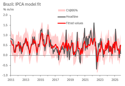
To obtain confidence bounds on the headline result, we employ the whole sample regression standard error formula, as below.
Where “y” and “y(hat)” stand for observed data and predicted values, respectively, “n” being the sample size while “k” the degrees of freedom, which are the number of parameters used to compute the model. To obtain the 95% confidence interval, we just need to add and subtract two times the standard error to our central estimate, while yields the previous chart.
We are done with our modelling and can now finally move into forecasting. For that, we need to come up with some additional assumptions.
It should all begin from calibration. We could take our coefficient estimates at face value and use them blindly, but that wouldn’t necessarily represent the future. We want coefficients that correct for further historical distortions that we don’t assume will happen, like massive exchange rate selloffs, supply chain disruptions (be it from things like Covid-19, or massive domestic strikes and natural disasters), or economic policy mistakes. Here’s a quick proposition in the table below.
The second assumption should state what we expect our component weights will be in the future, as they need to add up to the headline. In this case I find it simpler to communicate an assumption in which the last observed weight is the one that will stick around, which is not necessarily the most accurate. In mathematical jargon, we assume the weight series is a random walk.
After setting the model up along with these two key assumptions, we are set for forecasting. We can bottom up our forecasts for each component into the headline like so.
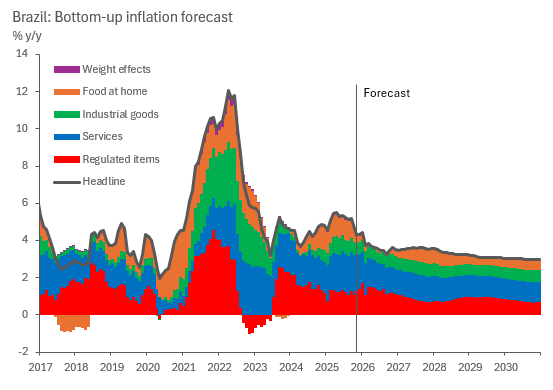
Which is a nice way to present the data as is. A good next step from here is to compare the yielding forecast with professional forecaster surveys and other forecasting institutions like the IMF, central bank and the local finance ministry. I am certain one can very easily match any of their numbers just by calibrating this model slightly differently.
Before I wrap up this section, I think its worth having a short point about in-sample and out-of-sample forecast analysis. For a long time I was a big subscriber of the practice that a good projection model needs to be estimated with a short sample and then evaluted across a “training sample”. However, I find that such practice varies wildly, to the point of often being meaningless, as important questions arise:
What is an adequate training sample? Doesn’t it beg the question that we don’t know what the future is to begin with?
How much of a model’s accuracy can be attributed to how forecasters calibrate it or incorporate shocks appropriately from high frequency news and regime changes rather than optimal sample/specification choices? The model pilot matters just as much as the modeller.
This said, I won’t disencourage anyone from running their own median absolute or square error analyses on the side on top of anything I said here. I just don’t believe in it very much anymore when it comes to actually covering a variable forecast routinely. Am happy to be proven wrong in the comments.
Concluding thoughts
It is a tough world out there for kids joining the work force these days, fighting against a lot of AI noise and senior people settling for “content generation” rather than precise and accurate thought. I hope my content empowers the people before the machines take over (LOL).
This has been, by far, the longest post of this blog up to now. Very complete, yet a lot of work. It is an experiment, if it does well I will probably carry on with more of this “From Zero to Hero” series. Will let the audience dictate the future of my content. Thank you for making it this far.
Thank you for this, Felipe. Your posts are extremely helpful, both for economists who are just getting into macro analysis and forecasting and for those who have been in the market for a while. Looking forward to following this series.
Hey, great read as always. This series sounds absolutly brilliant! Love the "From Zero to Hero" concept. Seriously, this kind of practical macroeconomic insight is so needed, especially for people starting out. And yes, the AI point hit home! Excited to follow along.