


The economics of international trade
How can the US afford to give it up?

In today’s post I’m going to present some economic insights as to why countries trade, the extent of its benefits and why the United States decided to neglect it. This might help shed some light and enrich the arguments on active import tariff policymaking.
We can start this topic by addressing right away the common misconception that foreign trade is just about tapping into other markets as a means of making profits and accumulating wealth. International trade, in this regard, is akin to domestic trade. It’s just another means of reallocating resources.
If a person exclusively produces oranges but would like to consume apples, that can only be achieved by selling an orange surplus for apples. Profits are only a way to afford a good you can't produce on your own. Thus, it is consumption that gives economic sense to trade.
It’s true that economic sense isn’t everything, though. Foreign trade, more specifically, is also a tool to bring countries together, split some apart from others, inflict pain and/or call for sovereign action. It has a whole geopolitical dymension, one in which to consume less, or more expensively, might be a justifiable sacrifice to achieve another kind of goal. Geopolitics do matter, but this is not what this post (or blog) is about anyway. Caveat aside, please allow me to stick to the economics.
From an economic standpoint, why do we trade? Which countries gain most from trading freely (and therefore stands to lose more without it)? Are there any losers from opening up for trade? How can the United States afford to give free trade up? As usual, I will address these questions by presenting my reasoning in the form of a model, and lay out it’s conclusions.
The model
Today’s model is a version of the Heckscher-Ohlin framework extended for three countries, two goods and an import tariff policy. The original framework is often presented with stronger assumptions for more specific points than the one that I’m about to present, but the detailed procedure I follow is available in an Excel spreadsheet, in this link. The story goes as follows.
Three countries (A, B and C) produce two kinds of goods (X and Y). X is capital intensive (requires relatively more machinery/equipment than human labour) and Y is labour intensive. To illustrate X and Y, think of X as smartphones, and Y as clothing. We can represent the production of these two goods with very similar equations that have slightly different parameters.
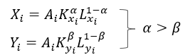
Here, X(i) and Y(i) denote the production of smartphones and clothing by country “i”, respectively. Output of each good is determined by the capital “K” and labour “L” inputs allocated into the production of each good, scaled by a level of technology “A”. At this point, we introduce assumptions to give our model more purpose.
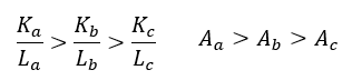
By these, we mean to say that country A is more capital abundant than country B, which is also more capital abundant than country C. Also, that country A is generally more productive than country B and country C from o a technogical point of view. Now let me call country A the United States, B the Western European economy and C any emerging market country. We do this purposefully as we want our model to represent these economies to allow us meaningful conclusions about them specifically later on.
Each of these economies is endowed with workers that lend their labour time “L” and/or their capital “K” in exchange of income to consume. Consumers draw utility from purchasing smartphones and clothing (aren’t you growing your own food, friend? You are missing out).

In these two equations, “X(c)” and “Y(c)” represent the consumed quantities of smartphones and clothing (including that favourite Ben 10 underwear piece you love) by consumers from each country. Coefficient “γ” represents how much weight consumers assign to good X versus Y, and often only takes a value between “0<γ<1” so that some consumption of each good is always required (we don’t want people walking naked out there).
These consumers supply local firms with labour “L” and capital “K”, making wage “w” and rent “r” for each unit of it, which in turn becomes the firms’ cost of production. If it helps the abstraction, we can also think of “r” as an interest rate consumers make from a savings account that becomes credit for firms to purchase machinery, equipment, land, whatever capital inputs they need. We can assume the banking fees away here for simplicity (what are banks good for anyway lol).
Economic sense is defined as consumption scaled by an utility function, the more consumption, the better. We determine welfare by the population-weighted sum of utilities draw by the consumers of each country.

Defining welfare is most important, as it allows us to compare the desirability of different policy choices more objectively.
The next step is a lot of general equilibrium shenanigans. Prices are discovered in an environment where firms are assumed to be “perfectly competitive”, meaning that they increase output until marginal costs equal to price. Nothing is wasted and the market clears, which means that every good produced gets consumed.
However, to draw interesting conclusions about trade, we are going to solve this model within three different situations. One in which countries produce and consume everything locally (each country is an autarky), another one in which they trade freely and specialise in what they produce best and a last one, similar to the second case, only however assuming country A (the United States), tariffs good Y (the good they take the least comparative advantage of).
Solving for general equilibrium is easier said than done, but the bulk of the assumptions made and groundwork is laid here, in text. The reader can resort to the spreadsheet for more detailed algebraic steps and even fiddle with the numerical example I am about to show.
Results (numerical example)
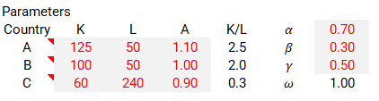
To obtain results we need to calibrate our model parameters in a way that complies with the conditions imposed by our story. We have three countries ordered by capital abundance and technology, two goods with different capital requirements for production made by a worker/consumer that will definitely consume both. The suggested calibration below works to our purpose.
The above calibration yields results summarised in charts below. Similar data, compared in two different ways. There’s a lot to unpack here. So bear with me and take charts from left to right, pushing aside the tariff regime just for now.

Left hand side charts are useful to compare how countries relate to each other.
In autarky (no trade), countries produce for themselves which therefore means price levels will be closely linked to how productive the average worker of each economy is. Country A thrives with the biggest access to technology and capital, highest real incomes and levels of welfare, life in easy mode. Country B is the intermediate case, but comes rather close to A. Meanwhile, country C is the poorest, and therefore consumes the least. It has the worst access to good technology, capital, and only really benefits from having a big supply of workers for that labour-intensive good Y (clothing). It’s a dog’s world out there for people in country C (at least they get to have loads of that cheap Ben 10 underwear we all love).
Now the right hand side charts compare how countries change across regimes best.
Welfare improves across the board as countries move from autarkies to free trading economies, however, the relative increase in poorer economies is much more pronounced (26.5% to be exact, in this calibration), the benefit from free trade is the lowest for country B (a little over 3%), which specialises the least. This happens mainly via labour productivity, which increases as countries specialise in the good that it can produce best by comparative advantage. Country A focusses on smartphones, country C does clothing, country B a little more smartphones than clothing. The world benefits from everyone having a little more of each good to go by.
These results answer our first two questions objectively.
Why do we trade? Trade allows countries to specialise in the goods they are comparatively better at producing, allowing more goods consumption for all.
Which countries gain most from trade? Emerging market, labour intensive economies that choose to specialise in the production of their most comparatively advantageous good, as it allows them access to capital intensive goods they wouldn’t be able to afford otherwise. They can also sell their labour intensive good more expensively abroad.
Moving on, let’s have a look at another chart.

As we look more closely to the sources of per capita income for each country we notice that while most incomes have increased in free trade, the least comparative advantageous workers from sectors X and Y for each economy ended up being displaced and were forced into the most comparative advantageous sector instead. This means an R&D smartphone developer firm from an emerging market country would have ceased to exist due to how much cheaper relatively it is to afford the capital required for that role in a richer country, and that, actually, made the emerging market country more productive (I’m pretty sure this is not a counterintuitive conclusion to most, so let that sink in). This means that while numbers do look much better when countries trade freely on an aggregate, trade-led productivity created an intense sectoral labour market friction underneath. Change doesn’t come without pain.
This answers our third question.
Are there any losers from free trade? There are indeed. The displaced workers from the least comparatively advantageous sectors in each country are expected to be displaced so that these economies can fully achieve specialisation.
For our last point we will look at a couple of other charts, as well as analyse the previous ones with a focus on the import tariff regime.
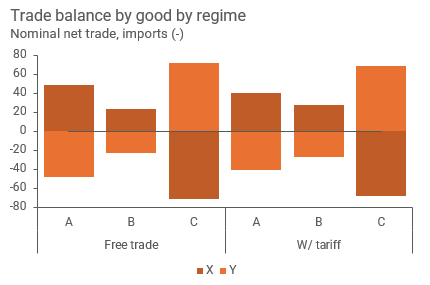
In the context of our model, trade balances by construction. However, the point about tariffs shrinking trade deficits stands, inasmuch as they shrink trade surpluses too. The major consequence of tariffs is reducing global trade. In the exercise proposed, we calibrated a 30% import tariff increase, which effectively lowers country A’s imports by over 10%. Global trade, measured as the sum of all imports or exports, takes a hit and falls by 3%. A material damage. Unsurprisingly so, this also reduces global welfare.
But when we look at our figure 1, tariffs barely leave a scratch to country A’s economy specifically. Welfare and productivity are broadly the same as the sectoral reallocation of resouces are rather minimal, it remains being a good X producing economy for the most part. Good Y becomes more expensive locally, but real incomes even increase as if we assume they are given back in the form of income tax cuts/subsidies. How so? Well, have a look at this chart.

The answer lies in terms of trade. By making the capital intensive good (X) more expensive relative to the labour intensive good (Y) and by being the main source of it due its high technology and capital abundance, it can afford to lower quantities offered while still increasing its income, just like a monopoly would. Under special circumstances a tariff can even end up making country A better off in the end.
In a worst case scenario, there is an argument for higher inflation in the short run due to a rise in local prices for good Y, but not enough to reduce real incomes, as its capital endowment appreciates anyway.
This allows us to tackle our final question.
How can a country like the United States afford to give up on free trade? It can because the price it pays is rather minimal. While the rest of the world as an aggregate is worse off, most of the welfare losses are concentrated in economies with poor access to capital intensive goods, while wealthier economies are supported by more favourable relative prices for the goods they are better at producing. This result, while counterintuitive to most, is also very important. It plays heavily against the possibility of an economic incentive towards the reversal of the recent import tariff hikes implemented by the US Trade Representative, for example.
Concluding thoughts
Today’s post tackled an applied economics question with an extensive, although very useful and informative, international trade model. I do encourage readers to give the spreadsheet a go and play with it to develop further on its underlying intuitions and conclusions, as there was a lot I left off for the sake of conciseness and objectivity.
I would also like to reinforce the point I make about this topic about tariffs and international trade extending well beyond the field of economics. We need to stay humble about how far we can take a single scientific field to explain all human affairs. I hope you found this content useful.
This is it for today. Thank you for making it this far and don’t forget to leave a feedback in the form a comment/share/like. It helps building this bridge between us.
It is funny because I've read some online articles about tariffs and they didn't mention this developed economy effect. Good text